In this help article you will find the information you need to navigate the Performance page of SIERA+.
What does the Performance dashboard show?
The Performance dashboard page will show you four things:
- An asset’s recent utility consumption, waste and carbon performance trends year-on-year.
- How these trends may be related to events taking place at the asset, for example, lease events or completed actions.
- Where data gaps exist. These gaps may be impacting the ability to report performance accurately.
- An asset’s performance being compared between a specific period last year, to the same period in the current year. Comparisons can also be made to see the progress of a target (where a targeted reduction is set) these can be seen both as a percentage and an indicative cost. Click here for more information on Target Variance.
What does the banner above the chart show?
This banner shows you the summary of the asset’s performance by selected utility type as well as for waste and carbon.
The performance, indicated in percentages and numbers, are based on:
- The asset’s performance relative to a set target.
- Comparison to last year’s performance if no target has been set.
Performance is measured in kWh for electricity, gas, fuels and thermals, water is calculated in m3, waste in tonnes and carbon in tonnes of CO2.
Note that estimated overspend is an indicative cost equivalence based on the kWh or m3 variance.
How do I change the timeframe to review the performance?
By default, the date range will be set to Year to Date but otherwise will be what was selected in the page you navigated from. You can select an alternative date range from one of the other predefined options or a custom date range from the date picker at the top of the page
Please note, if you have set a custom date range on the Portfolio page, and then view an asset in the Performance page and choose a different custom date range, the new date range will be applied to all assets as well as your Portfolio view.
What does the graph show?
The graph shows a monthly breakdown for the chosen timeframe.
The last year’s performance (or performance factoring the targeted reduction relative to last year) for each month is displayed as the dark horizontal line on the bar graph. The difference between performance is compared with the current year’s performance in either green or red.
Whilst targets are set yearly, seeing the bar graph in this way means you can see which months are on track for hitting or missing the target.
The visual nature of the graph also means you can pin-point events or activities that may have impacted the asset’s performance on a month by month basis.
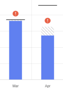
Any months with gaps in consumption will be displayed with a red warning icon and will be shown as a greyed-out section indicating that consumption data is missing. This is to highlight if data gaps could be adversely influencing performance variance against target.
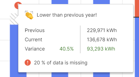
By hovering over the greyed-out area, a roll-over will appear showing more detail. For asset performance compared against the previous year, detail will be displayed in terms of current performance based on the date range selected, performance based on the same period from the previous year, and the difference (variance) displayed. The hover-over will also highlight if any consumption data is missing which may influence the asset’s current performance.
For asset performance compared against a set target, detail will be displayed in terms of the annualised reduction target to be achieved, the current performance variance based on comparison between usage this year against last year as a percentage, and the percentage variance displayed indicating the asset’s performance change relative to the required reduction.
As with variance against previous year, the hover-over will also highlight if any performance data is missing which may influence the asset’s current performance.
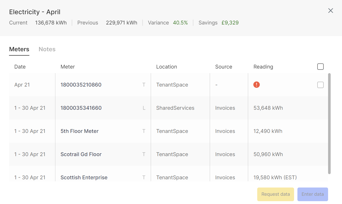
You can click on a bar in the Performance chart to open a modal for that specific month with more detail.
The Meters tab on the modal lists the consumption records for all meters in that month as well as meters with missing data. Should you wish to add in data missing for a specific meter, select the specific meter(s) using the tick box next to each one in the list and click Enter data which will open a new page. Once open you can enter the data directly into the web form.
To request data from someone, you can select the specific meter(s) using the tick box next to each one in the list and click the Request data button
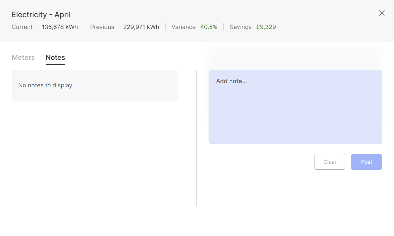
Where there is a variance in the consumption data, you can enter commentary by clicking on the Notes tab.
Should you wish to update a previous note, when you click on the note it will be highlighted in blue, and you can edit the note by clicking on the pencil displayed in the top right of the note.
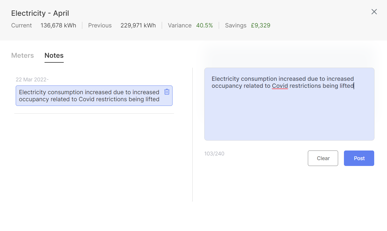
The symbols below the graph will highlight where commentary on consumption variances is required:
- Red indicates that there is missing commentary on the consumption variance for that period
- Blue indicates that commentary has been supplied and will display the number of comments that have been added

What do the events at the bottom of the page show?
The events table at the bottom of the performance page show all of the events that fall within the timeframe selected at the top of the page. These events comprise completed actions and commercial events which could be relevant in explaining performance trends displayed in the performance chart above.
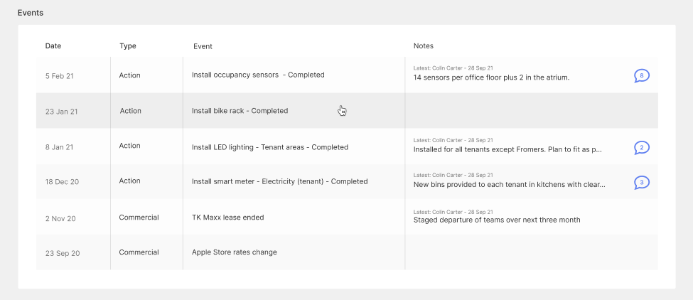
More detail on specific commercial events can be found by selecting an event to open a modal.
Comments
0 comments
Please sign in to leave a comment.