In this help article you will find the information you need to begin using the SIERA+ Portfolio page.
What does the Portfolio page show?
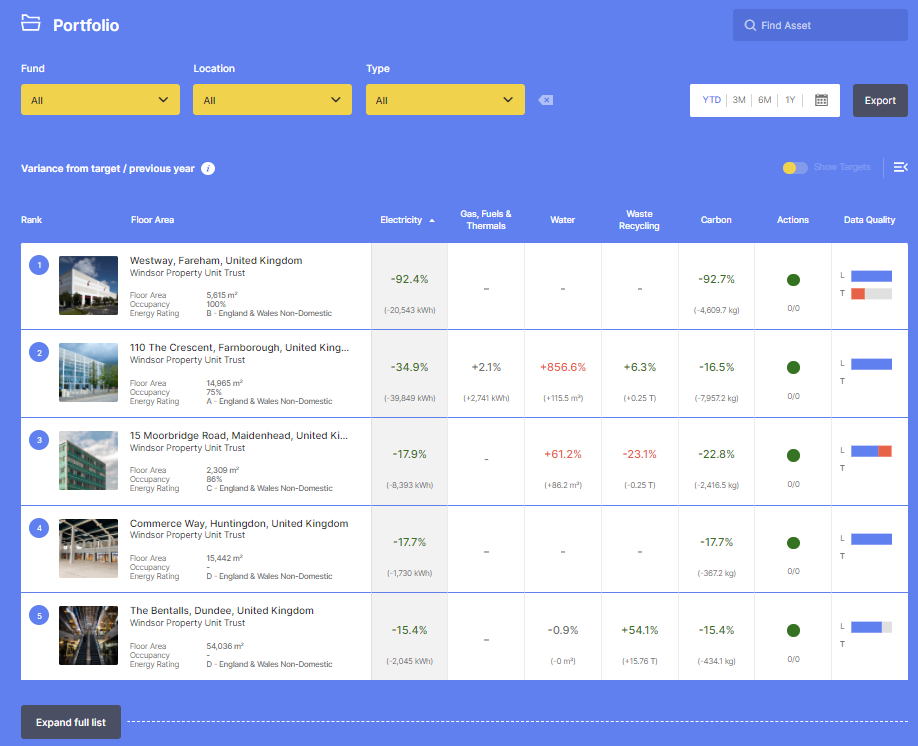
The SIERA+ portfolio page shows you an overview of all the assets in your portfolio and the overall performance of those assets. This includes: a property summary, including property name, location, fund, floor area, occupancy and energy rating; performance metrics for utilities, carbon and waste; actions progress; and a data quality score.
It includes their performance variances against targets for the date range selected which by default will be year to date, or where targets aren’t present, the target defaults to the previous year’s performance.
Variance to target is shown with two symbols:
- Where a variance is red with ‘+’ sign this shows that it is over its target.
- Where a variance is shown as green with a ‘–‘ sign is beating its target.
These symbols are designed to help you compare and prioritise action; quickly highlighting the best 5 and worst 5 performing assets against their targets. If there are more than 10 assets in a portfolio or selection, the list can be expanded to display all.
Further pages will break down in detail each of the elements shown.

Filtering and sorting asset information
How can I find an asset and filter assets by fund, location and type?
You can find a single asset by typing its name in the ‘Find Asset’ search box.
To find a group of assets, the yellow filter boxes at the top of the page allow you to view only the assets on screen which you want to see based on these criteria:
- Fund: Refers to the name of the fund the assets belong to. This enables you to show only assets in a specific fund.
- Location: Refers to the location of assets by country and by city. If your assets are across multiple countries the location filter will allow you to filter assets based on country. If your assets are in the same country it will allow you to filter based on city.
- Type: Refers to the sector type of the assets held within the fund. For example, office, retail shopping centre or industrial manufacturing.

How can I sort information?
By default the portfolio will be ranked by electricity performance from best to worst. You can click the column headers of the table to sort by the values in a column. For example, if you want to see which of your assets performed the best by Water (resulting in them having the largest reduction in water consumption against their target), select Water. Selecting the same option a second time updates the order from worst to best.
How can I set the date range?
By default, the date range will be set to Year to Date. You can select an alternative date range from one of the other predefined options or a custom date range from the date picker at the top of the page.
Further filters and viewing options

To the far right of the dashboard screen you will see two icons. These enable you to change the viewing layout of the screen and to include additional detail on target variance – see Performance Variance below.
The expand/collapse icon allows expand the asset list from top 5 and bottom 5 to all assets you have permissions to see.
Asset List
How are the assets ordered?
- All assets are assigned a number, seen in the top left corner next to the asset image. This number refers to their performance position against the selected ‘Sort By’ criteria. 1 = best performance and so on. This enables you to quickly see which assets are performing best and worst.
- The assets are ordered with the top five performing assets appearing at the top of the list and this can be flipped to the bottom five by clicking on the arrow icon at the top right of the table.
- They are considered the best performing because they are the assets with the biggest variance in performance compared to their target.
- Underneath the top five assets you will see an option to Expand Full List, when you click this all assets will appear.
- The five worst performing assets appear at the bottom of the list. They are considered the worst because they are the assets with the biggest variance in performance compared to their target
What information is there on the assets in the fund?
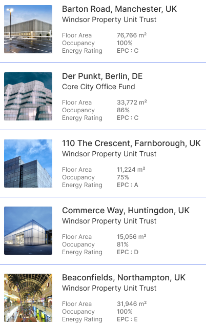
The Asset list on the left side of the dashboard is a list of the assets held within each fund, including asset name, city, country location, fund name and an image.
What is in asset description?

Underneath the asset description there are further details that give you an overview of the asset performance. This information is made up of:
- Floor area: the net lettable area (NLA) of the asset
- Occupancy: the average annual occupancy percentage for the current year to date
- Energy rating: Energy Performance Certificate (EPC) rating enables you to see the asset's whole building energy rating weighted by floor area.
On the Portfolio page you can see:
- Electricity: The variance against the asset’s target for electricity consumption from electricity meters, for the current year-to-date (YTD) (for example if current YTD is 3 months, then we’re comparing against the previous year’s same period of 3 months). This is shown as both a percentage variance against target and, underneath, the equivalent difference in kilowatt-hours (kWh). Where a target does not exist for a property then we default to the prior year’s performance for the same period.
- Gas, Fuels & Thermals: The variance against target for the consumption from gas, oil, district heating and district cooling meters for the building. This is shown as both a percentage variance against target and, underneath, equivalent difference in kilowatt-hours (kWh).
- Water: The variance against target for the usage of water for the asset. This is shown as both a percentage variance against target and, underneath, difference in cubic meters (m3).
- Waste recycling: The variance against target for the amount of waste sent to recycling. This is shown as both a percentage variance against target and, underneath, difference in tonnes (T).
- Carbon: The variance against target for the carbon emissions calculated for the energy (for example electricity, gas, oil, district heating and district cooling) consumption. This uses the relevant carbon emissions factors. This is shown as both a percentage variance against target and, underneath, you can also see the difference in kilograms of carbon dioxide (kg CO2).
- Actions: An indicator of the overall state of your actions. Your actions are colour-coded so that it’s instantly clear how the actions are tracking. The colours you’ll see are red, yellow and green.
Note. If no specific data is available for a criteria then it shows -.
How are the operational performance shown on the dashboard?
From the left the first five columns refer to utilities and each asset has separate information for each utility.
Each utility contains a colour coded percentage and the measurement or volume used. For example, KWh (kilowatt-hour) for electricity, T (tonnes) for waste and kg (kilograms) for carbon.

What does the data in the operational performancecolumns mean?
If the percentage is in the minus figure i.e. -18% then the usage for the last complete month was
-18% year to date.
If however the percentage reflects an increase in usage compared with last year to date then the number is highlighted in red with a pls, for example; +6%
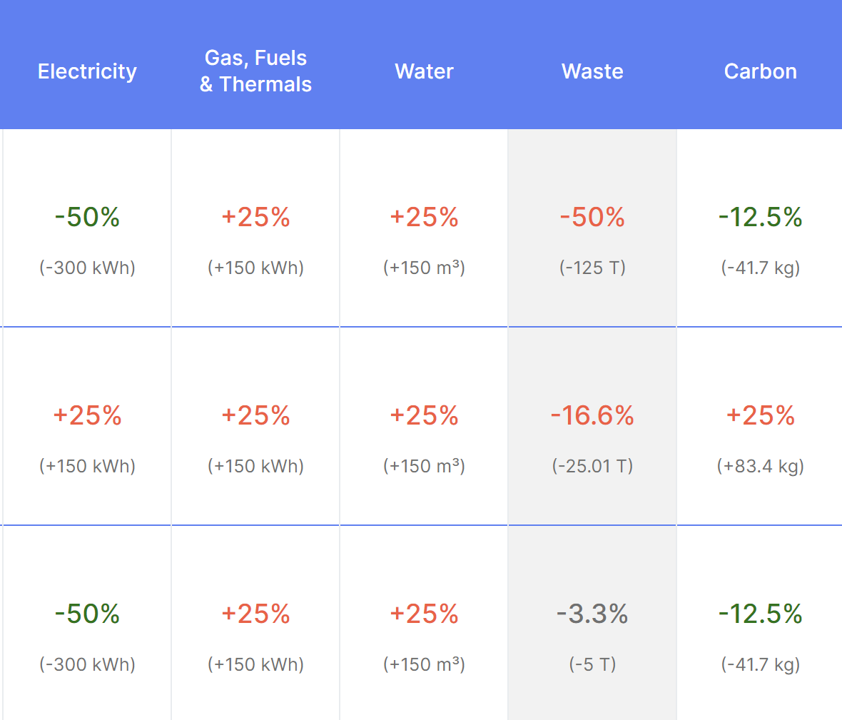
The number is red if it’s above 5%, and green if below -5%, if it’s in between its black.
If no specific information is available for a utility then NA.
What are the options for displaying target variance?
Performance is displayed as variance against target for the date range selected which by default will be year to date, or where targets aren’t present, the target defaults to the previous year’s performance.
You can see where targets are present for each asset and performance category by selecting ‘Show Targets’ on the top right of the page.

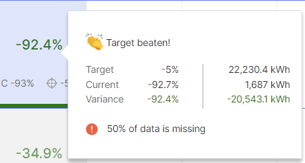
To view an asset’s performance variance details, you can hover over the variance figure displayed in either green or red, and additional information will be shown in a hover-over.

For asset performance compared against the previous year, detail will be displayed in terms of current performance based on the date range selected, performance based on the same period from the previous year, and the difference (variance) displayed. The hover-over will also highlight if any consumption data is missing which may influence the asset’s current performance.
For asset performance compared against a set target, detail will be displayed in terms of the annualised reduction target to be achieved, the current performance variance based on comparison between usage this year against last year as a percentage, and the percentage variance displayed indicating the asset’s performance change relative to the required reduction.
As with variance against previous year, the hover-over will also highlight if any performance data is missing which may influence the asset’s current performance.
To view only assets where a consumption reduction target has been set, you can toggle the Show Targets button to only display those assets where a target is present.

For any assets with a performance reduction target set, the main percentage variance is displayed indicating the asset’s performance change relative to the required reduction, the current performance variance compared to the same period in the previous year (C) as well as the annual target as percentages.
Assets without targets set will be greyed out making it easier to see the assets that do.
Note that target variance for waste recycling is displayed differently to utilities and carbon because targets to improve waste recycling usually refer to increases. This is why performance variances which are negative percentages are displayed as red.
What information will I find in the Actions and Data Quality columns?
Actions
The actions column has a colour coded green, red or yellow circle.

The colour is assigned to each asset depending on the state of the actions for that asset.
- Green: All actions on track
- Yellow: 1 or more actions are within 1 month of their due date
- Red: 1 or more actions are past their due date
- Underneath the circle there are two numbers, for example, 2/10. This refers to the number of actions in progress against the total number of actions.
Data Quality
The Data Quality column is the final column in the table provides you with a snapshot of the data available for the asset.
For each asset the data quality column provides key information in two colour-coded bars. A full bar represents data for 100% of the asset’s floor area.
- L: Refers to landlord-controlled property.
- T: Refers to tenant-controlled property.

The colour coded bars show an overview of key information.
- Blue: Means there is a meter/s for this area of the building and there is data provided for this asset for the year-to-date.
- Red: Means there is a meter covering this area of the building but there is data missing for this asset because it has not been entered for one or more months.
- Grey: Means that there is a meter/s covering this remaining area of the asset, but that data is not available. For instance, the tenant is not willing to share that data with the landlord.
- Blank: A void bar for the Landlord shows that all meters are covered by the Tenant. A void bar for the Tenant means that all meters are covered by the Landlord.

Comments
0 comments
Please sign in to leave a comment.